Klog HR Dashboard
Human Resources (HR) Business Case focused on People Analytics concepts and KPIs
About the Data
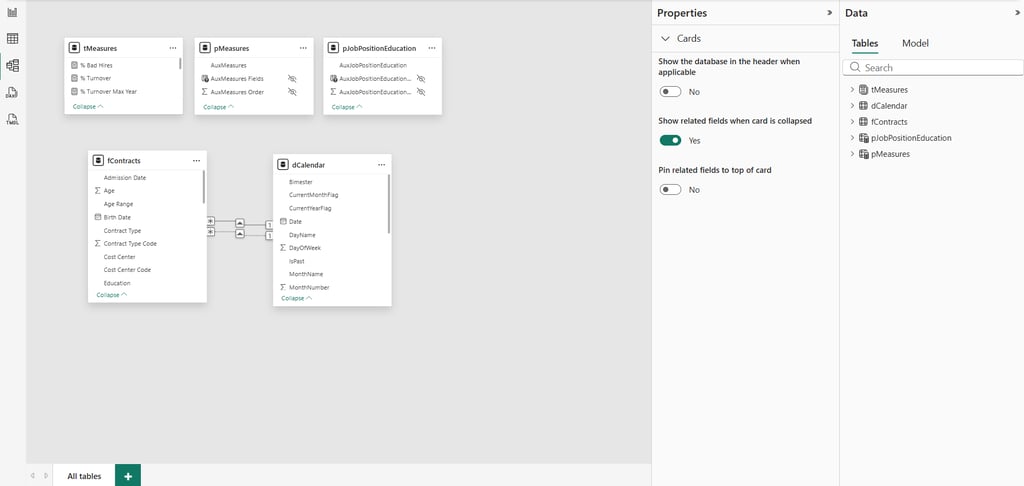
The dashboard is built on a structured data model with five tables, designed to ensure scalability and analytical performance. At the center is the fact table, fContracts, which contains the full historical record of employee events, such as hires and terminations over time. This is the main source for all calculations and insights.
Supporting this core table, the model includes a date dimension (dCalendar) to enable consistent time-based analysis, a measures table (tMeasures) where key business metrics are defined, and parameter tables that allow dynamic interactions within the dashboard, such as switching KPIs or segmenting data.
The data originates from Excel files, which are processed and structured before being used in the model. This transformation is handled through Power Query using the M language, responsible for extracting, cleaning, and shaping the data into a reliable format. Once prepared, DAX (Data Analysis Expressions) is used to create calculated measures, translating raw data into meaningful KPIs such as turnover, headcount, and bad hires.
The entire model follows a star schema, a widely adopted approach in analytics where a central fact table connects to supporting tables that provide context. This structure improves performance, simplifies relationships, and makes the data model more intuitive, enabling efficient and flexible analysis within the dashboard.
Design Building Process
Designing a BI dashboard goes far beyond just placing charts on a canvas — it’s about creating a clear, intuitive, and visually consistent experience that helps users understand data faster and make better decisions.
During the development of this project, I focused not only on the data model and KPIs, but also on building a strong UI (User Interface) and UX (User Experience) foundation. And like many BI professionals, I’ve faced common design roadblocks along the way: choosing a harmonious color palette, defining consistent typography, creating visual identity elements, and structuring a layout that truly enhances usability.
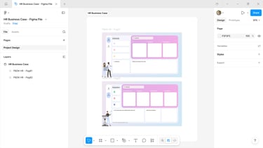
To overcome these challenges, I used Figma as the main tool to design the dashboard interface before building it in Power BI. Figma allowed me to prototype layouts, test visual hierarchies, and ensure consistency across all elements — from spacing and alignment to colors and typography. This step is crucial to avoid trial-and-error directly in Power BI and to speed up development with a clear design direction.
For inspiration and visual references, I explored platforms like Behance, which has become one of my main sources for high-quality design ideas. Instead of limiting the search to BI dashboards, I looked into a broader range of digital products to understand how designers apply UI/UX principles, structure information, and create visually appealing compositions. This helped me build a richer visual repertoire and apply more refined design decisions to the project.
By combining Figma for prototyping and Behance for inspiration, I was able to design a layout that balances aesthetics and functionality — ensuring that the dashboard is not only visually engaging but also easy to navigate, interpret, and interact with.
At the end of the process, the goal was simple: transform data into an experience that is both insightful and user-friendly, reinforcing the idea that good design is a key part of effective data storytelling.
In today’s environment, many HR teams still face a recurring challenge: spending too much time manually producing reports. Data is often scattered across multiple sources, and consolidating it limits HR’s ability to act strategically and make data-driven decisions.
This business case is built around that reality. It demonstrates how implementing an automated dashboard can transform HR from an operational, reactive function into a more analytical and proactive one — with real-time insights and stronger support for decision-making.
At the core of this transformation are a few essential KPIs. Metrics such as hires, terminations, and headcount provide a clear view of workforce evolution over time, helping track growth, reductions, and overall team dynamics. The turnover rate plays a key role in monitoring employee attrition and, when analyzed in a segmented way, reveals important patterns and potential retention issues. Complementing this, the bad hire indicator highlights early attrition within the probation period, offering valuable insights into the effectiveness of recruitment and selection processes.
What truly unlocks the value of these KPIs is data segmentation. Looking only at aggregated numbers is not enough — deeper insights come from analyzing data across dimensions such as department, role, tenure, and demographics.
To support this level of analysis, the dashboard is designed with clear and intuitive visuals. Trend line charts make it easy to track hires, terminations, and headcount over time, enabling the identification of workforce patterns. A turnover gauge provides a quick snapshot of overall performance, while KPI cards consolidate key metrics such as headcount, payroll, hires, terminations, and bad hire rates into a simple executive view. Interactive filters allow users to dynamically explore the data and uncover more detailed insights based on specific characteristics.
The result is more than just a reporting tool. It is a solution that transforms data into a clear narrative — helping HR understand the past, monitor the present, and influence the future with more informed and strategic decisions.