HR Turnover Dashboard
Human Resources (HR) case study focusing on People Analytics and KPIs concepts, highlighting Turnover.
About the Data
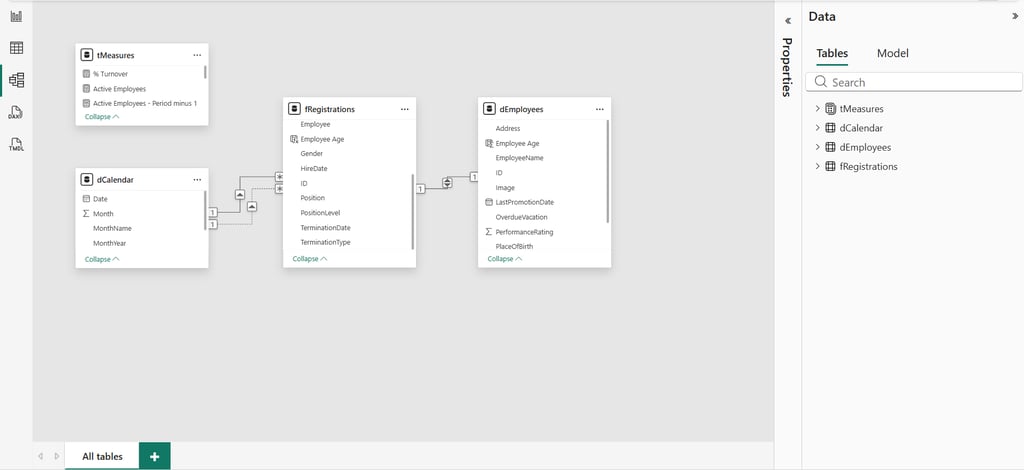
The dashboard is built on a structured data model with four tables, designed to ensure scalability and analytical performance. At the center is the fact table, fRegistrations, which contains the full historical record of employee events, such as hires and terminations over time. This is the main source for all calculations and insights.
Supporting this core table, the model includes a date dimension (dCalendar) to enable consistent time-based analysis, a measures table (tMeasures) where key business metrics are defined, and parameter tables that allow dynamic interactions within the dashboard, such as switching KPIs or segmenting data.
The data originates from Excel files, which are processed and structured before being used in the model. This transformation is handled through Power Query using the M language, responsible for extracting, cleaning, and shaping the data into a reliable format. Once prepared, DAX (Data Analysis Expressions) is used to create calculated measures, translating raw data into meaningful KPIs such as turnover, headcount, and bad hires.
The entire model follows a star schema, a widely adopted approach in analytics where a central fact table connects to supporting tables that provide context. This structure improves performance, simplifies relationships, and makes the data model more intuitive, enabling efficient and flexible analysis within the dashboard.
Design Building Process
Designing a BI dashboard goes far beyond just placing charts on a canvas — it’s about creating a clear, intuitive, and visually consistent experience that helps users understand data faster and make better decisions.
During the development of this project, I focused not only on the data model and KPIs, but also on building a strong UI (User Interface) and UX (User Experience) foundation. And like many BI professionals, I’ve faced common design roadblocks along the way: choosing a harmonious color palette, defining consistent typography, creating visual identity elements, and structuring a layout that truly enhances usability.
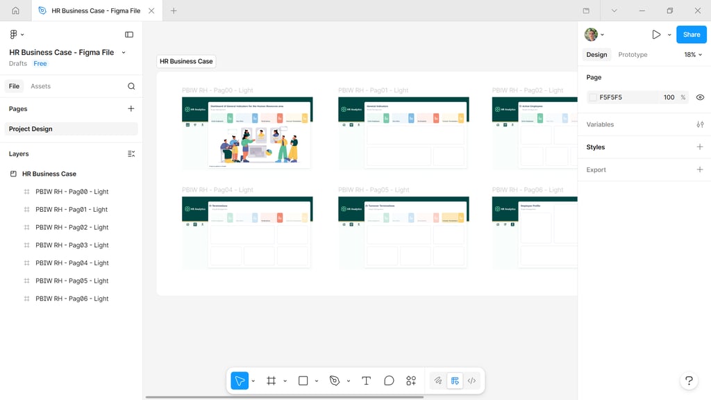
To overcome these challenges, I used Figma as the main tool to design the dashboard interface before building it in Power BI. Figma allowed me to prototype layouts, test visual hierarchies, and ensure consistency across all elements — from spacing and alignment to colors and typography. This step is crucial to avoid trial-and-error directly in Power BI and to speed up development with a clear design direction.
For inspiration and visual references, I explored platforms like Behance, which has become one of my main sources for high-quality design ideas. Instead of limiting the search to BI dashboards, I looked into a broader range of digital products to understand how designers apply UI/UX principles, structure information, and create visually appealing compositions. This helped me build a richer visual repertoire and apply more refined design decisions to the project.
By combining Figma for prototyping and Behance for inspiration, I was able to design a layout that balances aesthetics and functionality — ensuring that the dashboard is not only visually engaging but also easy to navigate, interpret, and interact with.
At the end of the process, the goal was simple: transform data into an experience that is both insightful and user-friendly, reinforcing the idea that good design is a key part of effective data storytelling.
In a data-driven environment, Human Resources plays an increasingly strategic role, and turnover stands out as a key indicator to understand workforce dynamics and retention challenges.
This business case was developed with a focus on People Analytics, using a Power BI dashboard to consolidate data on hires, terminations, and active employees. The goal was to transform raw data into actionable insights, enabling a clear view of workforce evolution and the factors driving employee turnover.
The analysis reveals a scenario of consistent growth, supported by hiring over the years, but accompanied by a recent increase in terminations. This trend becomes more critical when identifying that a large portion of exits are voluntary, suggesting potential issues related to organizational climate, career growth opportunities, or leadership.
A deeper analysis shows that turnover is concentrated in specific roles and departments, especially in technical areas. This highlights the importance of data segmentation to uncover patterns and enable more targeted actions, rather than relying solely on high-level metrics.
Beyond cultural impact, turnover also generates significant costs, including recruitment, onboarding, and productivity loss, making its management essential for overall business efficiency.
With the support of an interactive dashboard, it becomes possible to monitor these indicators in real time and act proactively, anticipating risks and supporting more strategic decision-making.
In summary, turnover analysis goes beyond numbers, providing a clear perspective on behaviors, risks, and opportunities, and positioning HR as a key driver of business value.